It’s been quite a while since I’ve blogged mainly as I’ve been recovering from knee surgery and so much has happened in that time I feel the need to update you.
The day before my surgery I get a message from Abs at AALL & Create asking me if I’d like to join their design team. Er… no brainer… yes please! For those of you that follow my design page on Facebook you will have noticed my love of all things AALL & Create but to be asked to join the team blew me away and I am still so thrilled. However, because of this I am no longer on the Visible Image DT which has been such a wrench for me but sometimes things change.
So there you have it. I’ve been beavering away making samples for AALL & Creates March release and you may have seen some of my samples on Hochanda but just realised they were mine… or maybe you did!? Thought I’d share a few of the makes on here now…
Astrantia – #452 Designed by Tracy Evans
Astrantia is a really beautiful stamp set and I just wanted to use it in a simple way to frame it. I’ve used Golden Crackle Paste for the texture and then added watercolour which has seeped nicely into the paste.
Hibiscus – #458 Designed by Tracy Evans
How beautiful is this stamp set? I just love it so much as there are so many elements you can pick out and use so you don’t have to stamp the whole stamp. The corner stamp is just so detailed an dI love the butterfly in amongst the circles and the text.
Through the Meadow – #449 Designed by Tracy Evans
Though the Meadows is a superb A4 stamp and has three elements to it and all three are just perfect!! Each has a circles running through it with text and chunky numbers and letters. Again, so much you could pull out and use.
Fastners – #13 and Twine – #15 Washi Tapes
This make just focuses on two of the new washi tapes in the collection which I’ve added to card and then die-cut to match the squares in the Superbly Square stencil. Simple but grungy and the washi is just divine!!
Scripted Diamonds – #470 by Bipasha BK, Reverse Diamonds – #484 by Autour de Mwa
The background stamps have been just fabulous. Background stamps are the one thing I have tons of and I use them for everything! With Abs and Bipasha joining forces to make sets, as such, they are essentials in my mind!
Right… I think that’s enough of my wittering today. I’ll share some more makes soon.
I have my Visible Images stamps and stencils stacked up, all facing me in one of those little trolleys that I constantly wheel out the way only to pull it back 30 seconds later. The Renaissance stencil ended up at the front of the stencils after I was flicking through them the other day and I realised I don’t use it nearly enough and it makes such a fabulous image when used with modelling paste.
The first thing I did for this make was to create a grungy background using Distress Oxide ink pads. I began by squishing Ground Espresso onto a glass mat and spritzed it lightly with water (I also spritzed the watercolour card I was using). By adding other brown tones you can make fabulous tonal backgrounds and I love this method. I also added Speckled Egg and the new Kitsch Flamingo as these colours often come through when the ink oxidises and both go beautifully with the browns. I’ve then used the Distress Oxide sprays to flick some colour across the background (again, I’ve used Speckled Egg, Ground Espresso and some Picket Fence too).
With the background dry, I added some Grunge paste through the stencil and, whilst the paste was still damp, sprinkled on Wow Embossing powders and left to dry. I used Seth Apter’s powders he created for Wow as they have a great textural quality to them and I am slightly addicted to them! Once the paste is dry, you can go ahead and melt the powder and I love watching it slightly bubble and spit while it melts.
I seem to use the Strobe stencil on nearly all of my makes but I can’t seem to not use it! It’s so perfect for everything and again, here it is once again. If you haven’t come across the cute little Ice pouches from Aladine and Seth Apter do check them out. They are translucent mediums and I love them for this quality. You can stamp/draw underneath and even with a fairly heavy covering of the Ice, you can still see through it.
The main focal image comes courtesy of Ahead of Our Time and I’ve heat embossed him using Oiled Slate form Wow Embossing. This is a fabulous mottled colour, slightly shimmery but not glittery. Around the edges I’ve painted Speckled Egg and Tumbled Glass and then added some Vintage Photo to the edges while dotting the steampunk eye with some Spiced Marmalade before using Glossy Accents in a few places.
The arrows around the edges are from the Destination Unknown set and I love these, although I lost the little arrows immediately after using it! Gutted! Anyway, they’ve been stamped using Onyx Black from Versafine and then heat embossed using a clear powder.
The sentiment has also been clear embossed and ‘escape’ comes from the same Destination Unknown set while ‘life’ is from The Worlds Needs Art stamp set.
Here are the Visible Image products I used for this make…
Renaissance
Strobes
Destination Unknown
The World Needs Art
Don’t forget to share any Visible Image makes you create on their group page over on Facebook. There is always lots of inspiration to be found. Likewise on Instagram. If you follow the hashtag #visibleimage you’ll get makes from all over the world on your feed, which is awesome!
Hey everyone… how is your year going so far? Hope you managing to find time to create in all of the chaos going on around us.
As Valentine’s Day is nearly upon us, I thought I’d use my DT make for this week to spread a little love and use this fabulous set, Love is Love, from Visible Image.
Every time I use this set, I love how it turns out no matter what colours or what mediums I choose to use and for Valentine’s Day it is bang on absolutely totally perfect for everyone.
To start, I stamped both profiles onto watercolour card and then sprinkled with clear embossing powder. Once cooled, I used watercolours to add the three colour.
I also stamped extras of the little images from the profiles (the flower, butterfly, moth etc) as I wanted to layer these later on.
I wanted a card that could be sent to anyone so chose the colours accordingly and used watercolours to get the fluid effect.
Once trimmed, I’ve coloured the ‘extra’ images too and added foam tape to the backs. I decided to add some cheesecloth like I normally do (I finds it separates the layers and adds texture) but not actually sure it’s worked this time round as on closer it looks like a big hairy wart maybe?! I can’t unseeded it now I see it – if you get me!
To try and lessen the look of the cheesecloth, I decided to stamp and layer the small images once again to draw your eye away. I then fussy cutting around each shape, coloured with a contrasting colour and then layered with foam tape before slightly shaping the wings and petals.
To accentuate the ‘love’ word on the right profile, I stamped it again and then used Spun Sugar (the same as I would later use on the background) to add colour.
The background is made using the two small heart stamps from the Have I Told You set which I’ve stamped using VersaFine Clair (Charming Pink, Monach and Paradise) and then heat embossed using Wow’s clear embossing powder. Over this I’ve used Distress oxide ink pads (Spun Sugar, Shaded Lilac and Tumbled Glass) to create a wash.
For the main sentiment, I’ve stamped two ‘love’ sentiments using the Forever Love set (as it’s a slightly larger text) and then used the same watercolour colours as I used on the profile to colour.
All that remained then was to assemble the card and matt it onto black card to make those colours pop!
I absolutely love this set. So many different elements to pick out and use even if you don’t want the profiles, you could still stamp the images freehand so avoid the edges. Ooh… just had an idea! Haha!
As always, check out the Visible Image Facebook group for challenges, giveaways and loads of inspiration. If you’re on Instagram, tag any projects you make using Visible Image products with #visibleimage so everyone that follows the hashtag can see them and they are some incredible makes from all around the world cropping up.
I’ll be back again soon with another DT make. Look after yourselves. H xx
One Kind Word. Says it all at the moment doesn’t it? I don’t know about you but I’m getting rather cheesed off, angry (at who I don’t know) and feeling quite isolated now. I’ve worked right through the last 2 lockdowns but this time I’ve been off work with a dodgy knee and it’s been hard so I really feel for those of you that are doing this on your own or with very little support. Even the weather has been appalling. Thank fully I have my art to turn to and wow what a saviour it has been. Taking it all out on page, even if it looks rubbish, it doesn’t matter.
Seemed appropriate for my Visible Image DT turn to make something a little more light hearted than maybe I’ve been feeling and I have to admit I love the One Kind Word set. You can sneak quite a lot on that little piece of paper trapped in the typewriter, although this time I’ve gone for just one of the sentiments in the set.
I’ve gone with a pink theme for this make although I was originally toying with the idea of a blue/turquoise mix but I had this old gelli plate background in my drawer (that I’ve been saving for ages and didn’t want to use) and picked the pink to go with it. The print is a mop up print (a print you do to ‘clean’ your plate of paint/ink) and I love the mop-ups usually more than the prints themselves. You get these crusty bits of old paint picked up and I just adore the texture it creates. Perfect!
First thing I did was to create the heart. This is just a generic die-cut heart, approx 10cm across that I inked using Spun Sugar and Worn Lipstick. Having then attached the Strobes stencil over the top, I added Picked Raspberry oxide ink. However… it all then went a bit wrong. I was adding some beautiful Tattered Angels Glimmer Spray (Lovely Lilac) for a bit of shimmer and the bottle fell over and went everywhere.. Uh-oh!
So rather than start again, I went with it as actually it looked lovely and heat dried it. The spray gave a really subtle lilac colour and where it had run, the mottled effect was quite pleasing (although I wouldn’t recommend tipping your inks everywhere).
Once dried, I secured the Strobes stencil in place (again) and added the Picked Raspberry. To add to the overall love and kindness theme, I used Words of Support stencil and just masked off the word ‘love’, adding it using Candied Apple oxide ink pad.
The typewriter was really easy to do. Simply stamp in black and then heat emboss using clear powder. I also heat embossed the sentiment using a grey ink instead (VersaFine Claire Morning Mist).
Once trimmed , I coloured the ‘paper’ in the typewriter using Old Paper and Tea Dye Distress Ink pads (not oxides).
With the type writer added to the heart using foam tape, I used the small hearts in the One Kind Words stamp set to float around the type writer and to add to the general theme. These were just heat embossed onto gold card and attached using teeny tiny foam squares.
I then decided that ‘something’ was needed behind the heart to and so settled on my old favourite stencil, Strobes. Rather than just use modelling paste, I used Izink Ice as it’s translucent and is just fabulous! I applied a thin-ish layer of Freesia using a palette knife and then allowed to air dry.
Once the Ice dry, I added foam tape to the rear of the heart and to add extra texture (because that’s what I do) I then twisted some black cotton onto the tape to break up the background.
The sentiment was heat embossed using gold powder onto a similar coloured scrap card I had and then matted onto gold card.
With the card complete, I matte it onto the same gold card as the sentiment and then onto black card to make those colours ‘pop’!
Here are the Visible Image products I used for this make…
From left to right… Strobes, Words of Support and One Kind Word stamp set.
If you pop over to the Visual Image Facebook Group page at the moment, you’ll see there is a ‘Hope and Colour’ challenge running. Just upload a card, tag, journal page, anything using Visible Image stamps that is colourful and has a hopeful or kind sentiment to be in the draw to win one of three vouchers. There are some fabulous entries already and it doesn’t close until 31st January so still plenty of time to get involved. You can also post any make onto Instagram too as long as you remember to tag Visible Image in (@visibleimagestamps). So do get involved. Helen and Mark have been super generous this year already and I know this will continue as they are awesome people!!
Catch you all again soon. Stay safe, do what we have too and don’t put loads of pressure on yourself. H xx
Hello to you all and a very happy new year to all of you. I hope you’re all well and that Christmas was the best it could’ve been… certainly very different for me but I’m back with some new Visible Image inspiration for you and I’m hoping to ‘up my game’ a bit this year and push myself into new directions.
I’ve been having a bit of a clear out in my craft room of late. I gave a huge amount of paper pads away to some neighbours and in my clearing up I found some half used canvases of which this is one.
Before I gave it a couple of coats of gesso, the canvas was a pale blue with various stamped images, it even has some tissue paper strips down one side but none of the bothers me as I love a bit of texture!
Once I’d gesso’d it (gesso is a primer so is a good base for most surfaces) I clear embossed Fibonacci in a couple of random places so that once I added ink, the image would come through and give some white texture in the background.
I used Distress Oxide Sprays (Chipped Sapphire, Rustic Wilderness and Evergreen Bough) for this make as I love their matt and almost chalky finish and just dabbed them on using the tiny straw in the bottle and brushed them on. I did go over them using blender brushes just to neaten the surface slightly before adding crackle paste with the fabulous Count Me In stencil.
While the crackle pastes dries I began on the little circle (5″ in diameter) and this is just to break up the rectangle really, to add more interest and somewhere to focus the images. I’ve used Organics to continue the crackle theme that I’ll be using on the main bulb. Having stamped it using VersaFine Clair Morning Mist, I used a clear embossing powder to add a bit of sheen and to protect the stamping as I wanted to add Distress Oxide inks over the top.
Like the canvas, I added crackle paste through Count Me In again to tie the two together.
With this complete, I dripped Tattered Angels Glimmer Mist (Bittersweet Vine) onto both the circle and the canvas and then used a watercolour fan brush to sprinkle on watered down gesso.
When stamping the bulbs, I masked out the middle images from the larger ones. To do this, I used masking tape cut to cover the image and removed it after the ink. Having then stamped the bulb onto a sheet of scrap paper, I cut out the bulb interior so I could stamp the shattered glass effect from How Fragile We Are. The bus were stamped in VersaFine Clair Nocturne and the shattered glass in Morning Mist. Both were heat embossed using clear embossing powder.
You could use whatever you prefer to colour the bulbs but I love these Arteza Brush Pens as the colour is beautifully vibrant and that’s kind of what you want in a bulb, no?! With the colour in place, I used a watercolour brush pen to blend and neaten them up.
To highlight the broken effect, I used Glossy Accents to add a glass look to the bulb and Organics on the circle and it looks amazing!
With the bulbs and crackle paste drying, I turned my attention to these gorgeous moths from Glimmer of Hope. Stamped in Nocturne VersaFine Claire again, these too were heat embossed using clear powder before being coloured with brown shades of the Arteza pens.
Having trimmed all the images, I added foam tape to the backs to give them extra dimension on the project. Having looked at the bulb wondering how to attach it, I decided to wrap some wire around the cap so it looked like it was almost hanging.
With everything made, it was time to layer the images up and secure them into place. It was at this point I felt the larger moth needed some extra dimension so I stamped the wings again onto vellum and attached them slightly lower than the original so you can see his second set fluttering away.
I now have this hanging in my craft room and it looks just fabulous (even if I do say so myself!). Although your eyes are naturally drawn to the bulbs, you’re pulled down by the texture from Count Me In and the smaller moth.
These are the Visible Image stamps and stencil sets I’ve used for this make…
I’m really excited to push myself this year… get out of that comfort zone and experiment more than I usually do and I’m excited to see what new designs Mark and Helen make for us because I know they’ll be spectacular as they always are!
There’s been lots of inspiration over the Christmas period on the Visible Image group page on Facebook so do pop in and if you’ve made anything new why not post it up! I love to see everyone’s makes and ideas. Don’t forget Instagram and Pinterest too… check out the #visibleimage on both for loads of creativeness!
Thats’ all from me today. Look after yourselves and I’ll catch up again soon.
Well hello and welcome to Christmas! It officially starts today in my house… the advent calendar is out, the Christmas scent is wafting through the house, the majority of my Christmas shopping is done (mainly all online this year like everyone) so I felt it was only right I shared a Visible Image Christmas card today!
I know pink isn’t you’re typical Christmas colour but I love this for the background… it really ‘pings’ and I really want to remake this card for my daughter who is a very pink girl – if you get me!
The background is made using Distress Oxide ink pads (Picked Raspberry, Worn Lipstick, Spun Sugar and Candied Apple) and I’ve used them as watercolours so smooshing them onto a glass mat, giving the card a wash of water before adding the colour so you get a fabulous watery look. You could also use the Distress Spray Stains for this, use whatever is at hand.
Once dry, I’ve used the Christmas Eve stencil and Tonic Nuvo’s Indian Gold Embellishment Mousse to make this gorgeous sentiment. Once dry (about an hour I find) I’ve added some Candied Apple Distress Oxide. I used an ink pad as before but again, you could use spray and apply using a paint brush around the wording. I’ve outlined the gold sentiment using a Derwent Intense pencil to really help it ‘pop’.
The bauble strings have been heat embossed onto the background using Wow’s Black Onyx powder and a little shadow added using a Comic marker.
I love using text on backgrounds and I like them slightly distressed, not fully stamped so you get a bit of texture. Here I’ve taken the Christmas Backgrounds stamp set (which is brilliant!) with Versafine Clair’s Charming Pink ink pad and then heat embossed using Wow’s clear embossing powder, which gives a nice sheen to the text.
The beautiful baubles were made using watercolour card and I’ve drawn around the baubles and cut from the card. I wanted a distressed look to the baubles so scrubbed up the edges before adding the individual decoration. Once decorated, I’ve used the Freestyle Tool from Wow Embossing to scribble around the circles (and around the card itself) and add a beautiful gold colour. The baubles have then been added using some foam tape so you get a little dimension. To finish, I’ve matted the card onto black card and then onto an 8×8″ card blank.
A really bright, modern card from me today but there are so many more over on the Visible Image group page on Facebook and on Instagram too. Lots of inspiration to be found on Pinterest so do pop over there and lose a couple of hours!
Today I’m sharing a card using the new Rise and Shine and Midnight Sky stamp sets from Visible Image… and you may have noticed I’ve squeezed in the Lava stencil too for clouds.
The mixture of the two stamps works brilliantly and I really enjoyed playing with the textures and layers… as always!
How fabulous is that sunny sun?! She’s beaming out and I’ve used two layers to make the best of her sun rays. What you can’t see on the photo is a little hint of gold shimmer around the sun’s face but if you look really (really!) closely you can see a bit of a shimmer on the darker orange on the left there.
The wonderful sparkly clouds have been made using Visible Image’s Lava stencil and crackle paste to which I sprinkled on a white shimmer embossing powder while the paste was still fresh. Once the paste has dried, then you can melt the powder and you get this fabulous bubbly texture… which for me is just amazing!
I adore the Midnight Sky set… that little moon and the dinky astronaut that comes with the set is just perfect. Here I’ve coloured the moon using Arteza brush pens and I love the pale purple I’ve used on him… with that grey?! Delicious! He’s on a galaxy style background with a few Posca pen splatters here and there and those tiddly stars are heat embossed… and I don’t mind the extra splats of powder around them as it kind of echoes the larger stars.
Obviously the large stars are also heat embossed and layered up with foam tape so the star and I’ve scrunched some white cotton underneath for extra texture and interest.
And the sentiment… well… it’s just perfect and totally true and I love it.
I’ve made a short video for this make which you can watch here… it even has some funky music so you don’t have to listen to me wittering on! Haha! I’m trying to get into making videos and tutorials more but I find I have to be really organised in my making and I’m just not that type of maker. An idea will spark off a general idea but I have been known to completely do a 180 degree turn and make something entirely different but it’s great making the videos and I’m chuffed with how it’s come out.
If you didn’t catch the recent Facebook Live that Helen and Mark did with all the latest DT samples you can watch it here. Lots of ideas and inspiration and amazing makes from my fellow fabulous DT ladies and of course all the new stamps are available to order now and I know they’ve been super popular once again!
Don’t forget you can find Visible Image on all the socials… Facebook, Instagram, Pinterest and Twitter so do give them a follow as they sometimes just give their stuff away!! Shocking behaviour!! Haha!!
Hope you’re all well and good?! I’m just going to ignore everything going on in the world right now and just concentrate on the latest release of stamps from Visible Image! There’s six in all and today I am sharing my make using the gorgeous Phoenix Rising.
I love the grungy look of this set look forward to exploring and experimenting more with it to make something not so obvious, if you get me, something away from the fire and hot colours… I’m just not sure what yet!
This set has one main stamp, the Phoenix, and then two fabulously abstract stamps which I’ve used as flames on this make. You also get two sentiments ‘Hope’ and ‘We Rise By Lifting Others’ which couldn’t be anymore poignant at present.
The background was made using Distress Oxide Sprays (Mustard Seed, Carved Pumpkin, Ripe Persimmon and Candied Apple) and I’ve made it so the lighter colours are in the middle. I’ve just sprayed them and spritzed on water to allow them to drip a bit.
I’ve mopped up the left over spray on my mat using some watercolour card and left this to dry. I would be using this later to stamp the Phoenix on as the main focal point.
With the background now dry, I’ve used my go-to stencil from Visible Image, Strobes, and a product which is new to me; Izink Ice in Melted Butter. The Ice is a translucent gel/paint and for me it’s just perfect as you can see layers underneath the you use it.
You can heat dry the Ice which is perfect for me as I’m super impatient the it comes to waiting for things to dry and I actually quite enjoy watching paint dry with a heat tool.
The fabulous Phoenix on the card was stamped onto that mopped up card I’d saved and stamped using Versafine Clair ink pads (Cheerful, Summertime and Tulip Red). It’s then heat embossed using WOW’s Clear Embossing Powder. I’ve repeated this 3 times in total to get a good depth on the Phoenix.
I used the same method of stamping and heat embossing (using the same colours) to create a tinted fire like layer at the bottom of the card. The great thing about using a glossy clear embossing powder is the amazing glaze it gives you!
After edging the card with black ink, I’ve added the sentiment which has been stamped on the off-cut of card I used for the Phoenix itself and also edged it in black. To really make those colours ‘POP’ I’ve matted the card onto black card stock and then onto a 7×7″ card blank.
You can exactly how I created this card by clicking on this link here that will transport you to my (new) YouTube channel. There’s not a lot of content at present but over time will fill up nicely so if you fancy subscribing, you’d be very welcome!
You can see all the new stamps from Visible Image on Create & Craft on Thursday November 12th with Mark, some of our DT makes and a couple of fabulous demo’s!
That’s all from me today. Lots of inspiration using the new stamp sets over on Instagram and the Visible Image Facebook group page so do check those out. If you’re on Pinterest, there are LOADS of images to mooch through an again ideas and inspiration from so do take a peek!
Three little words that seem so, well… happy! I absolutely love the Just Be Happy stamp set from Visible Image. The sentiments are punchy and in your face and I just adore the fonts and those little squares around the letters.
Sometimes a sentiment doesn’t need a fancy card to balance it. Sometimes the sentiment is all that is needed really or that’s the conclusion that I came to with this make.
This was soooooo easy and quick to make and I just love the swirly rainbow with the Time Tunnel stencil.
I’ve trimmed a 6×6″ square of 300GSM watercolour card as I knew I’d be adding lots of water to get the effect I was after.
Tape the stencil down well (I popped a little bit of tape on the middle circle too).
I used Versafine Onyx Black for my Time Tunnel but you could use whatever ink pad you prefer. For the embossing powder, I’ve used Wow’s Ebony Black Superfine powder. I’d normally use a black ink and then use their clear embossing powder so you don’t get any black speckles but I wanted a really black-black so thought it was worth the risk!
Sprinkle the powder over the image and then heat. Don’t worry too much if it’s not perfect as it’s a grungy card and you won’t notice on the finished make.
Once heated, you can start adding colour. I’ve gone for a rainbow look using Arteza Brush pens but you could use whatever you have to hand… watercolours, watercolour pencils, you could even smooch an ink pad on a mat and use that with some water… same effect!
I’ve added plenty of water to my colours and then dabbed with kitchen roll if it got out of hand! I wasn’t bothered that it was patchy in places, to me that just adds to the make.
All that is needed then was the sentiment and I chose Just Be Happy because it seemed to go with the cheery and bright colours!
You’ll see this card, along with lots of others on Create and Craft on November 27th! In the meantime, catch up on everything Visible Image by heading over to their website and subscribing to their weekly newsletter… and of course Pinterest has everything Visible Image so you can get inspiration from all their stamps and stencils past and present (which I find invaluable in times of brain silence!)
As I type this post up it is a vile day here. Windy, rainy, really horrible but for me it is perfect crafting weather and I look forward to these Autumnal days with the weather beating on the windows… makes me feel all snug inside.
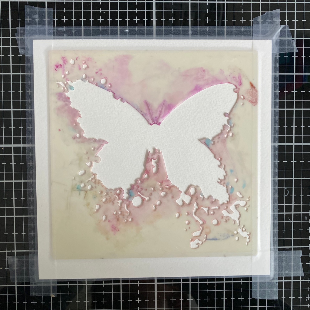
My make for Visible Image today is a super simple one but I absolutely love it and am going to be making some more for cards for friends. I’ve used the beautiful Butterfly Ink stencil and one of the Just Be Happy sentiments and that it… very sparse for me!
I had intended to do something much more convoluted but sometimes the simplest ideas are the best.
I began by taping the stencil to watercolour card. I generally use watercolour card as it holds up to whatever I throw at it which is usually quite a lot! It’s 300GSM hot press card (which means it’s smooth) if anyone is interested!
I’ve then smoothed the glorious and gorgeous Golden Crackle Paste through the stencil and my word, I love this stuff. The Golden paste is so light and fluffy, it’s like stencilling with whipped cream.
The colour comes from Wow Embossing Powders ‘Pop’ powder. A mix of a vibrant orange alongside silver and white grains which gives a beautiful effect.
The powder has been sprinkled on to the paste while it’s still fresh (damp) so it sticks and then I let it air dry overnight which is when the crackles appear. Once perfectly dry, melt the powder… and I never tire of watching the melt!
I had intended to drip colour down the butterfly so it seeped into the cracks but I decided to keep it simple. Instead, I used the new-ish Speckled Egg Distress Oxide Spray to paint around the butterfly and leave lots of white space – which is very not me!
I do love the subtlety of the pale Speckled Egg against the real bright intense colour of the orange and then the little cracks across the butterfly look just fabulous!
The Life is a Journey sentiment, from the Just Be Happy set, is perfect (I thought) for a butterfly and I’ve used Carved Pumpkin Distress Oxide Spray to add the colour and then given a couple of the letters some glossy accents just as a change in texture.
Why not have a go at re-creating this card? You don’t have to use the Butterfly Ink stencil… the technique would work with any of the Visible Image stencils.
if you’re a Visible Image fab (and why wouldn’t you be?!) you would have seen the recent ‘Facebook Lives’ by Mark and Helen showcasing some of the Christmas stamps and stencils alongside some of their other ruddy marvellous stamps. If you’ve missed any of them, you can catch them all on the Visible Image page under the videos section.